
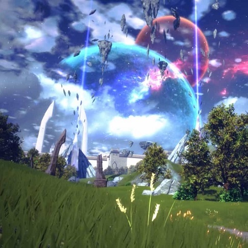
He’s not wrong; making nicely styled anything in UI is a PITA.
with a simple menu like in Nier Automata
If you go and break down all the little things it does, it’s actually not that simple. It’s not quite as in-your-face as P5’s menus were, but there’s a bunch of little transition effects – things like the triangle dissolve when opening it and a particular typewriter text effect that types out characters with deliberately wrong letters before correcting itself. Areas changing color like progress bars – which can be interrupted and which reverse themselves nicely if the user changes tabs so that you get a transition effect without delaying the user much. An overall styling that’s reminiscent of old LCD screens – which needs to work cohesively with the rest of the game design. Subtle changes to the music when the menu is open. Special animation sequences (e.g. in ending E). Etc, etc. Individually none of them is all that hard, but putting it all together was probably still a PITA for whoever wrote it.





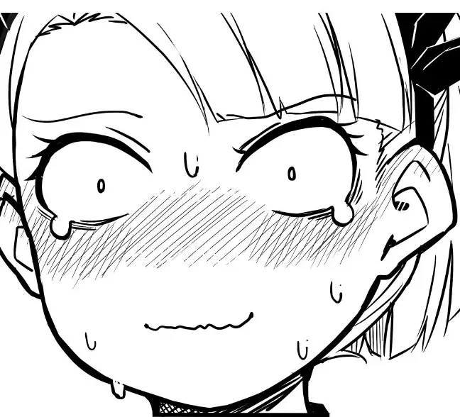



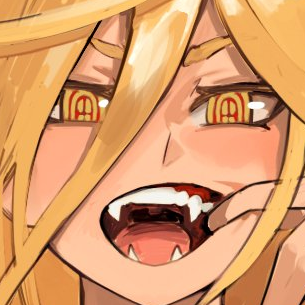



I went and tracked down the specific image on danbooru since a query for the artist was linked instead, unusually, and I find the specific image links helpful. Here it is in case anyone else wants it too: https://danbooru.donmai.us/posts/1911964
The artists other works are worth checking out as well though! I recognize a bunch from songs on YouTube that I encountered a few years ago.